GÊNESIS ASSOCIADOS
Genesis, in many ways was one of the most enjoyable work undertaken by our office, either because of the end product in terms of design, as the experience of being involved in a completely new market. As we understood the importance and the dimension of its product, as it is not easy to be detailed. In short, it is a company that offers a completely independent estate planning, which makes it even more interesting. In a world immediate and situated in a country where the people in general are not used to saving, thinking about the future or even thinking about the worst, Aigo, the CEO of Genesis invites guests to reflect on the bad days, and provides comprehensive advise if those days come, you are forewarned. Genesis is not a life insurance company, neither an investment company, and not a company of real estate speculation… Genesis is a company that takes care of its customers, guiding and instructing for your needs whatsoever.


VISUAL IDENTITY
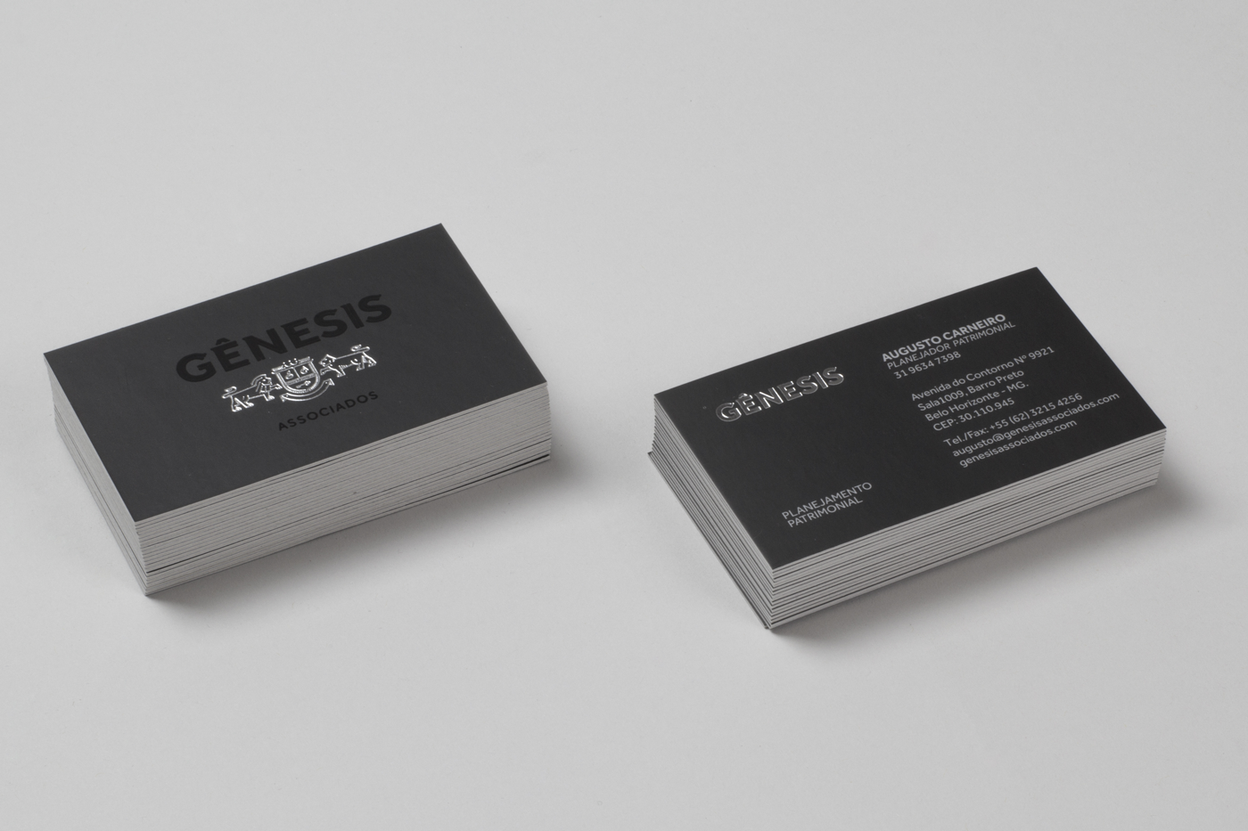
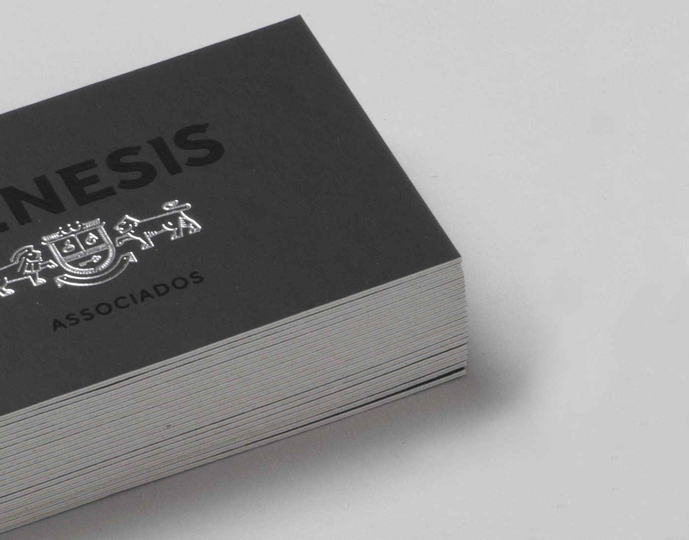
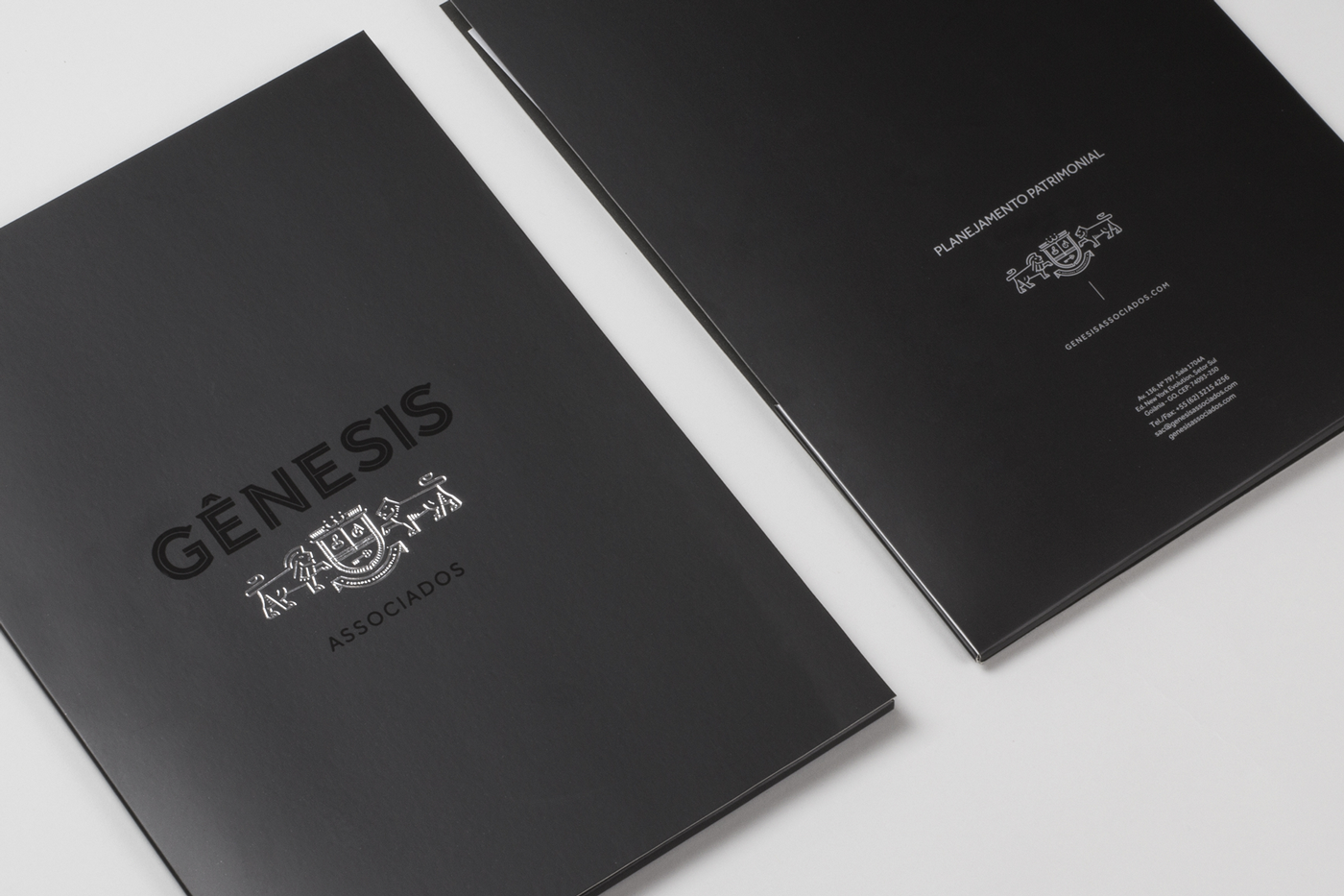
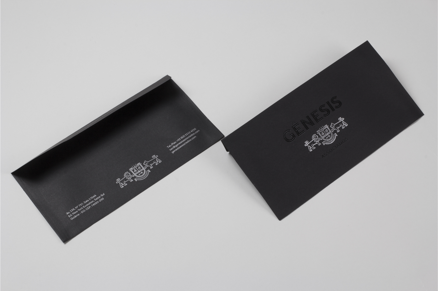
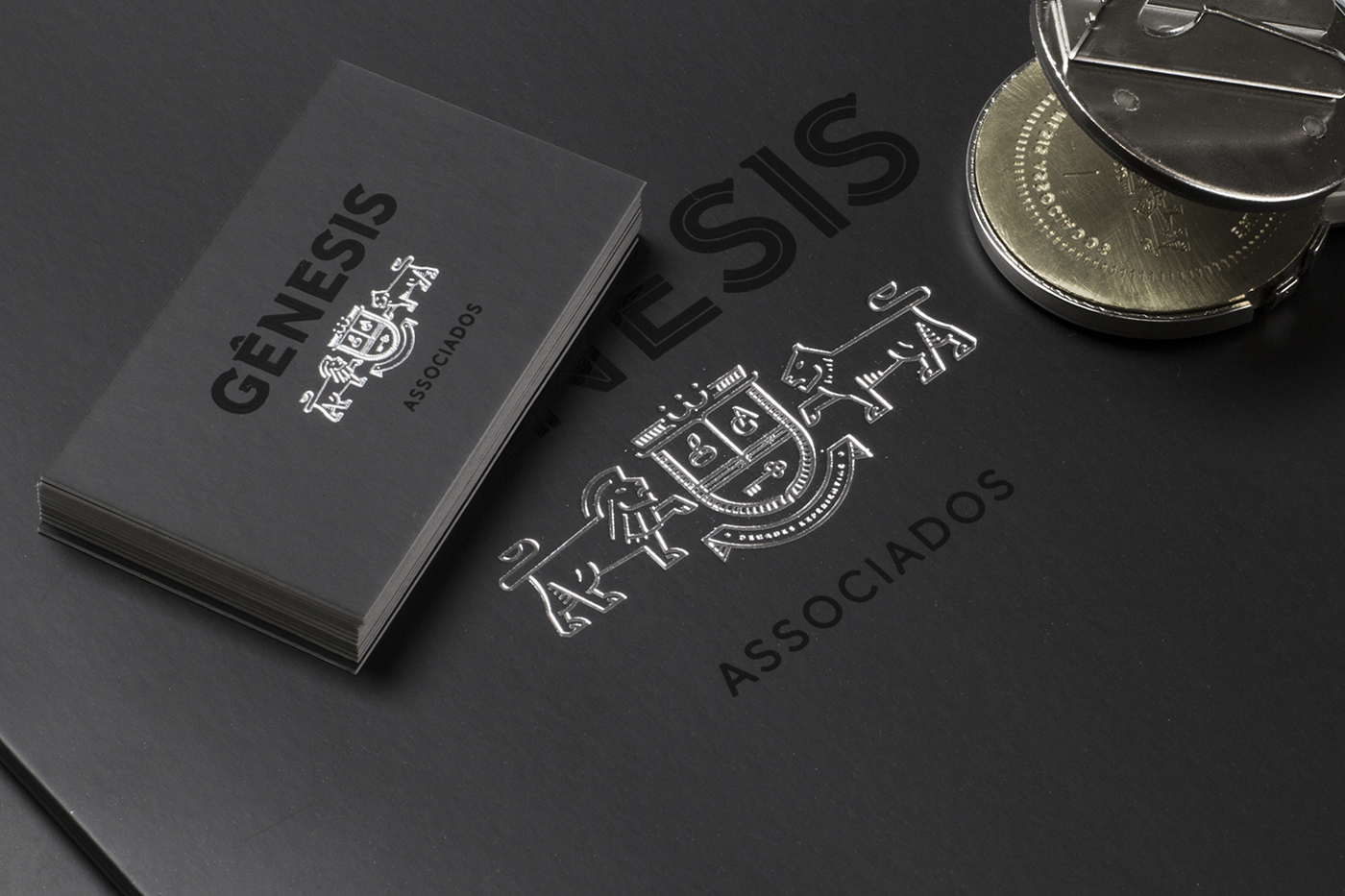
Knowing the mistrust that initially the work of Genesis offers, we used of their tradition to acquire customer confidence. Soon we began to work with elements that relate directly to this kind of visual appearance and history. From the logo, where we added strong semi serifs in a grotesque typefamily, a coat of arms made with lines inspired by money/document authentication guilloche.
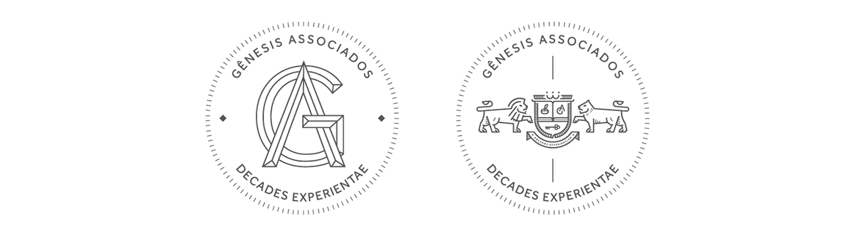
COAT OF ARMS
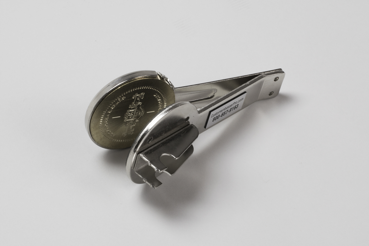
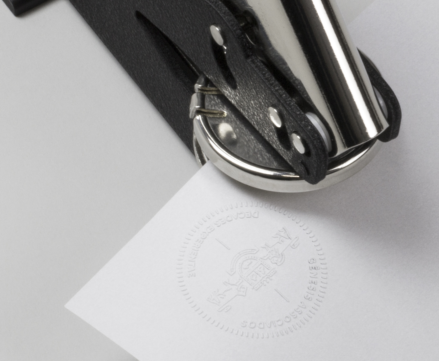
The shield of the coat of arms is formed by the primary values of the company, the book represents knowledge, the seed which is planted, the monogram "GA" and key members of Genesis, which, as they themselves say, the key to control of your own life . The support elements could not be two lions, because there they fulfill different roles, they are like lions in some respects, but for other tasks the lioness needs to be called, together, they form a complete team.
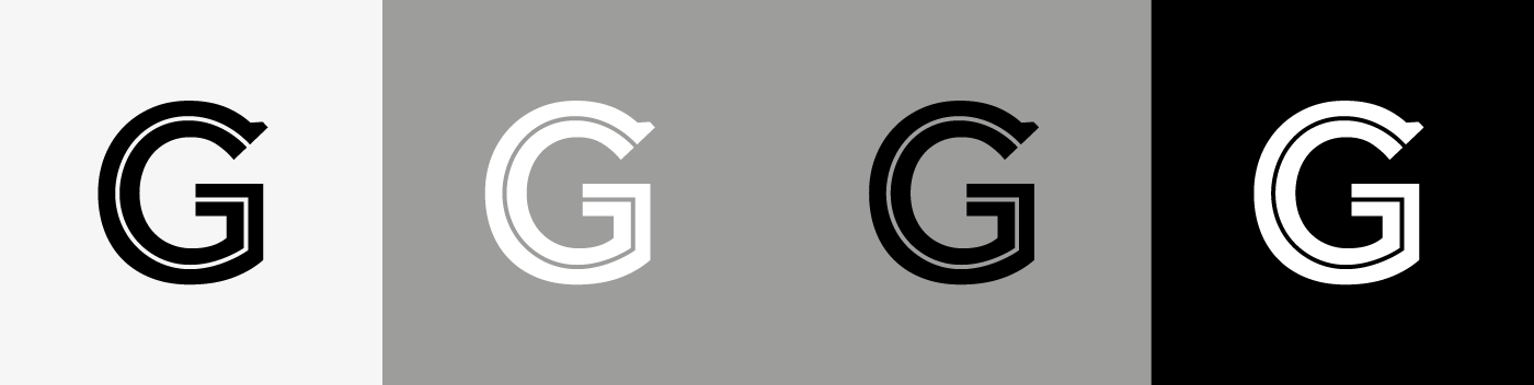
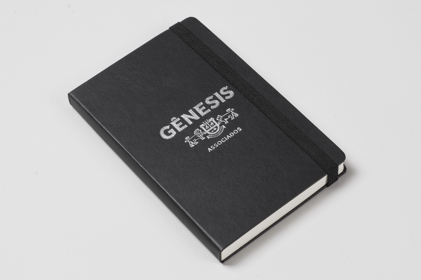
LOGOTYPE
As already stated, we work with a kind of grotesque type and strong semi serifs were added, inspired by a printing of an old Brazilian ballot. However, when we put the logo next to the symbol, the symbol was too light, the contrast between the full type and lines inspired guilloche was clearly upsetting the harmony of the whole composition. Then, we use one of the visual elements that we still had, which is the type charactetistic mostly know as "inline", which in this case also refers to pinstripe suits, stylish and very present in the visual universe that is part of Genesis. With this treatment, the logo was given more lightness and its behavior with symbol came to an ideal measure.
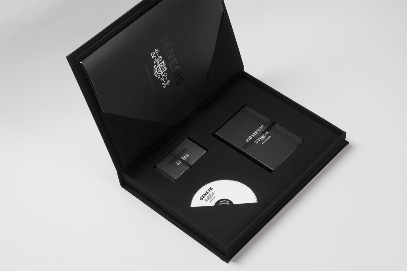
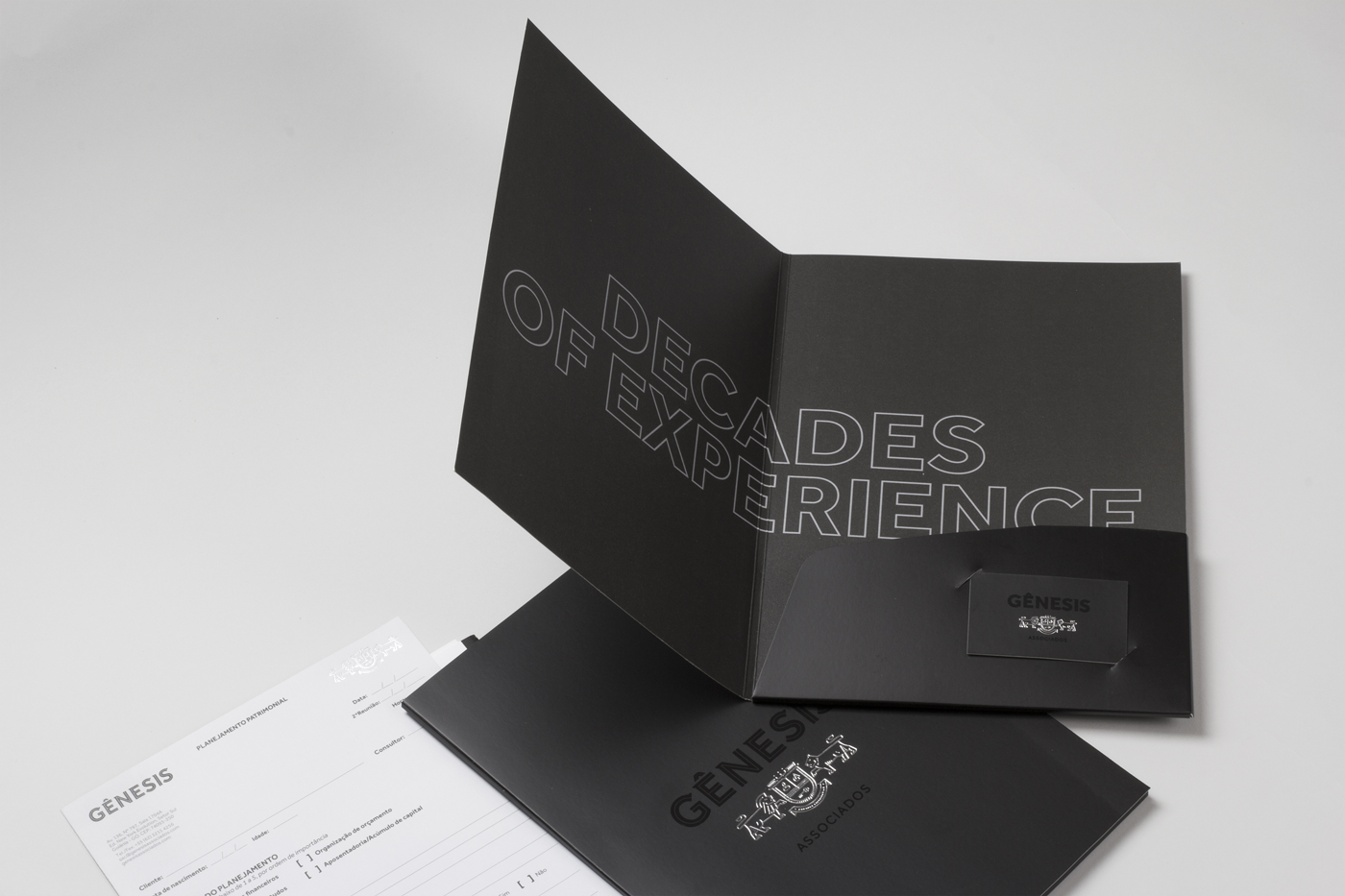
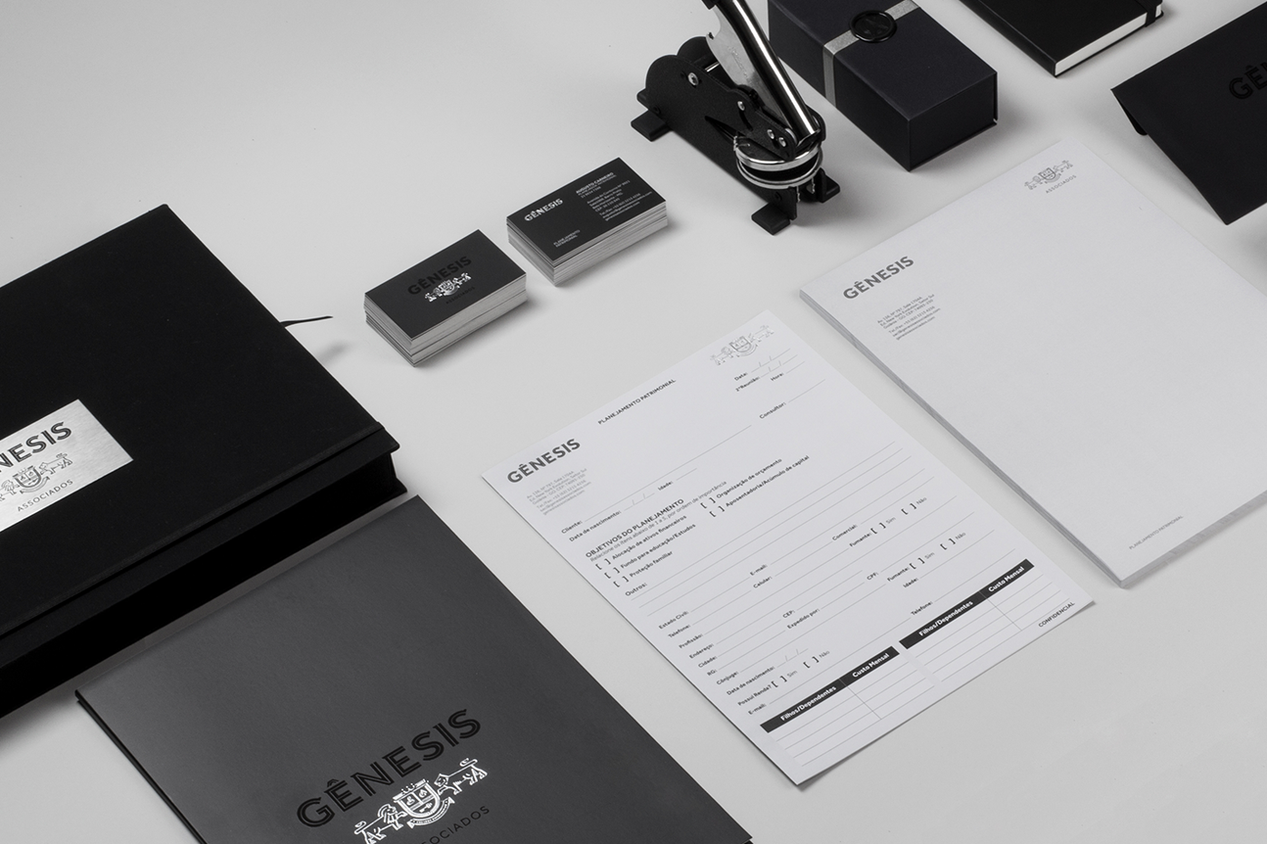
SIGNATURES
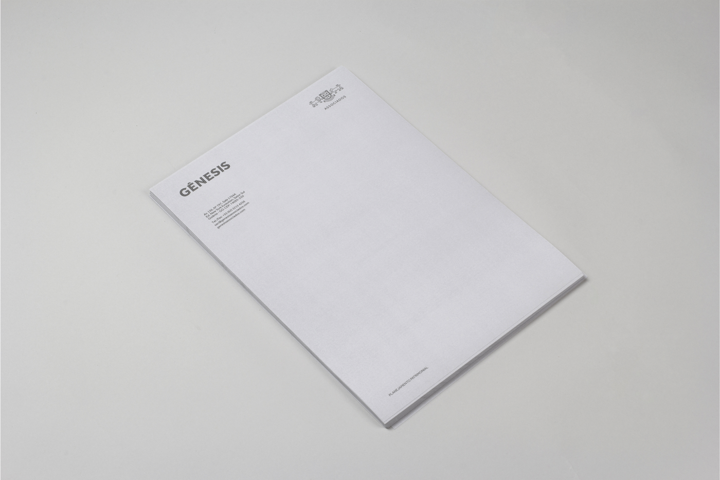
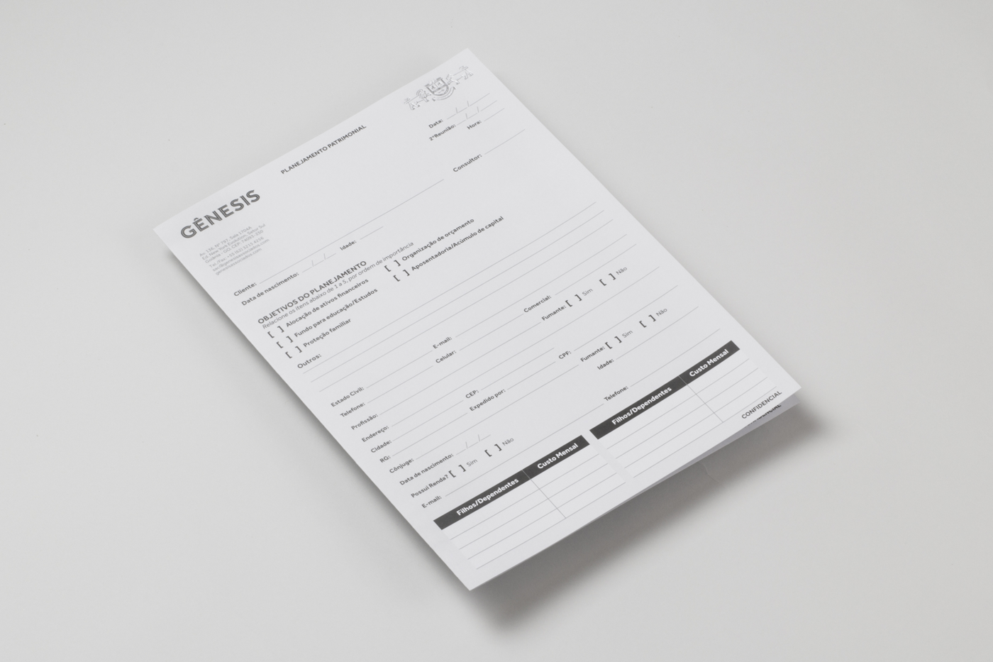
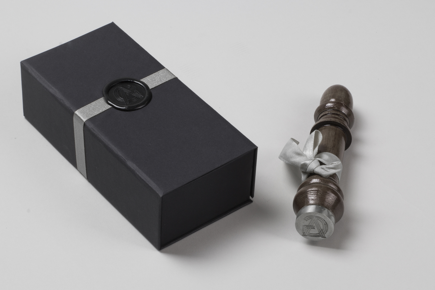
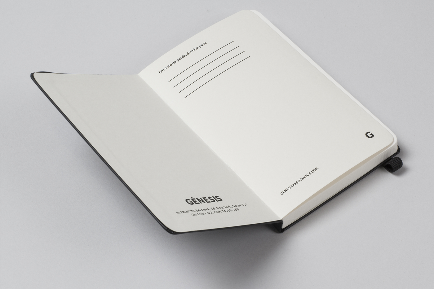
Like any brand, it needs to be applied in several places, and therefore we developed various signatures to make sure the functionality of the brand in its applications. As we will see later on the use of the "G" separate from other information and a monogram, "GA" which is a clear reference to stone carved typography.
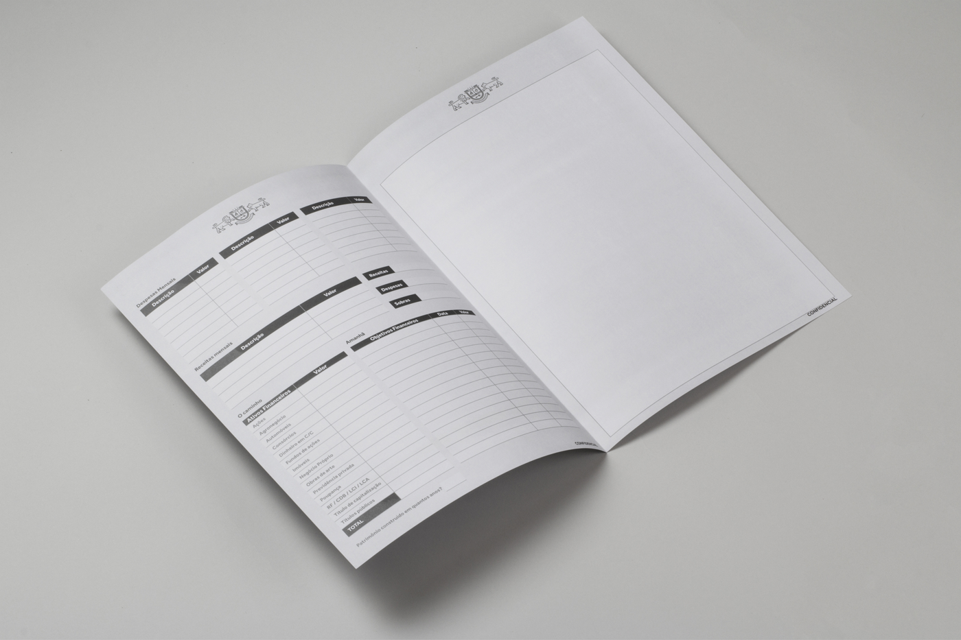
The highest tone of the project is undoubtedly the elegance and sophistication in it, but at the same time sobriety, of those who stay behind the scenes guiding those who need guidance.


-
CREDITS:
Creative Direction / Design: Braz de Pina & Rodrigo Francisco
Assistant Designer / Researcher: Gabriella Bitencourt
Follow us on facebook: www.facebook.com/brbauen
Twitter: twitter.com/BRBAUEN

