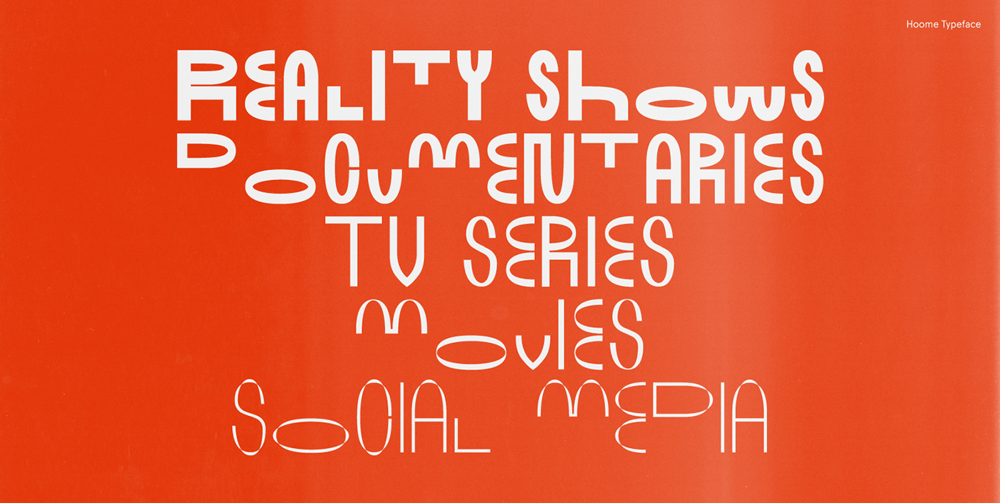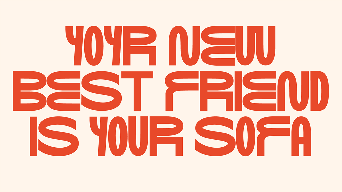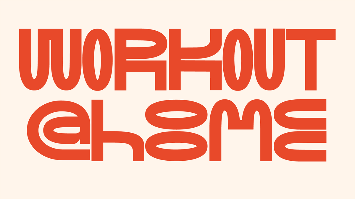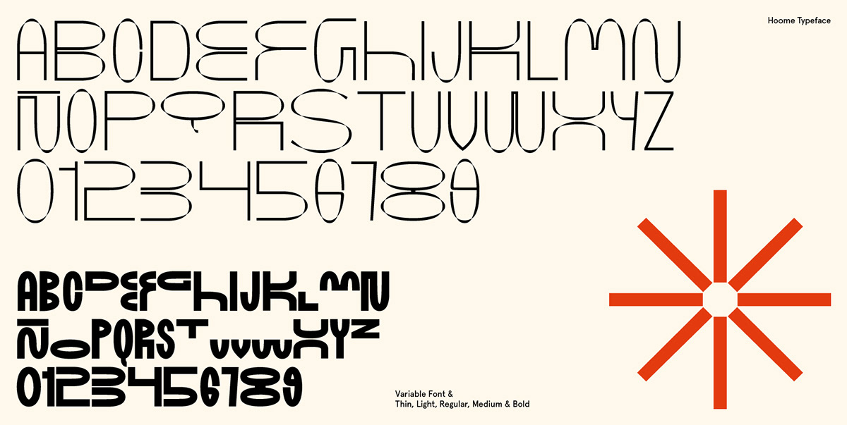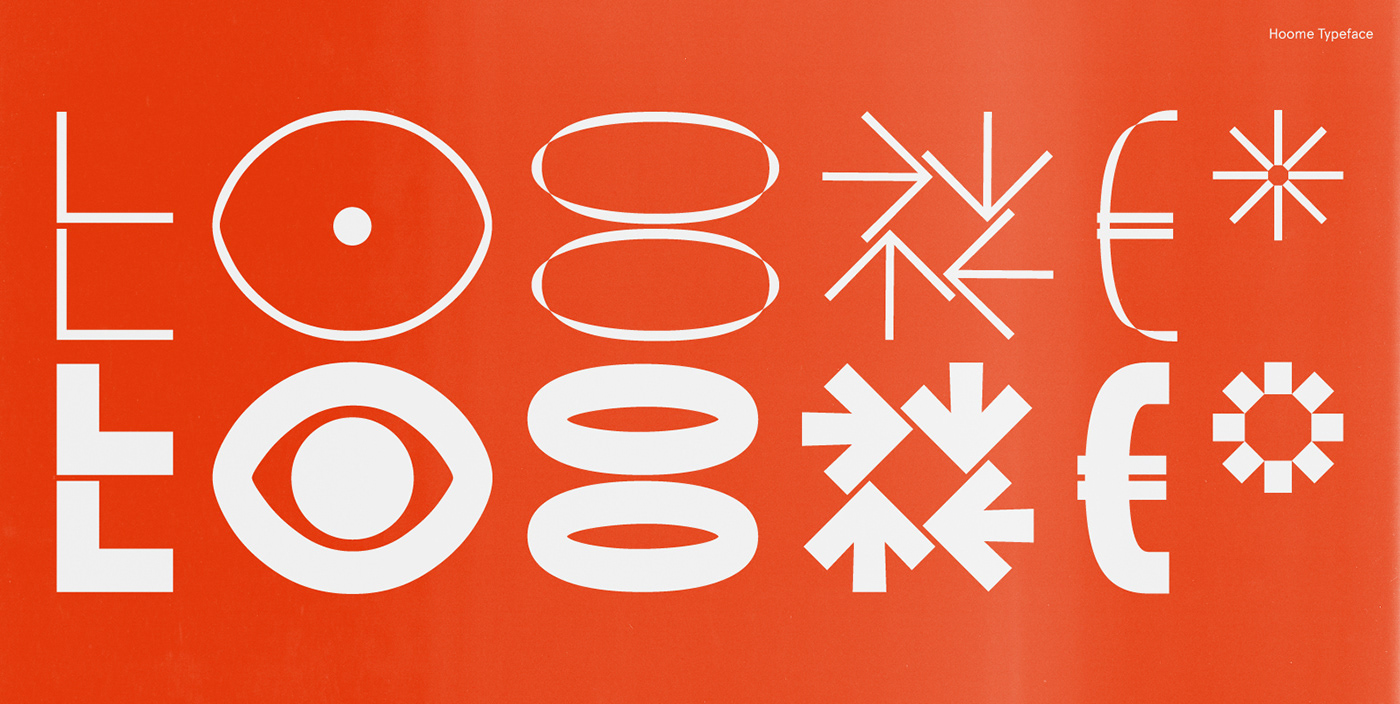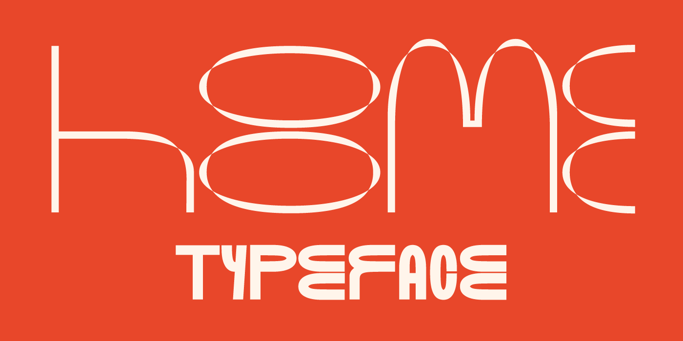
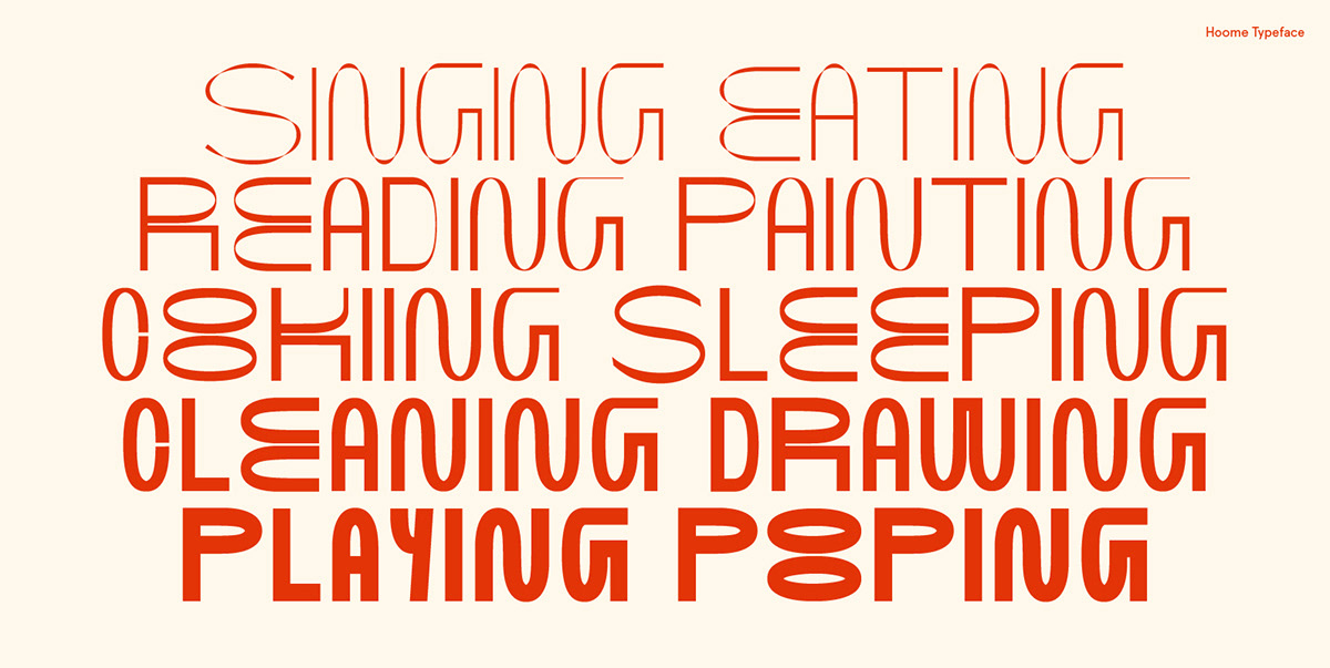
From the "OO" to the world
While we were locked up at home we have developed a variable type and also modular. We start from the double "o" as the main module from where we get the curved pieces and proportions to develop the rest of the typography. We have also tried to alter the traditional metrics of typography, why not? We propose the whole family to double height having as reference the space between the two "o".
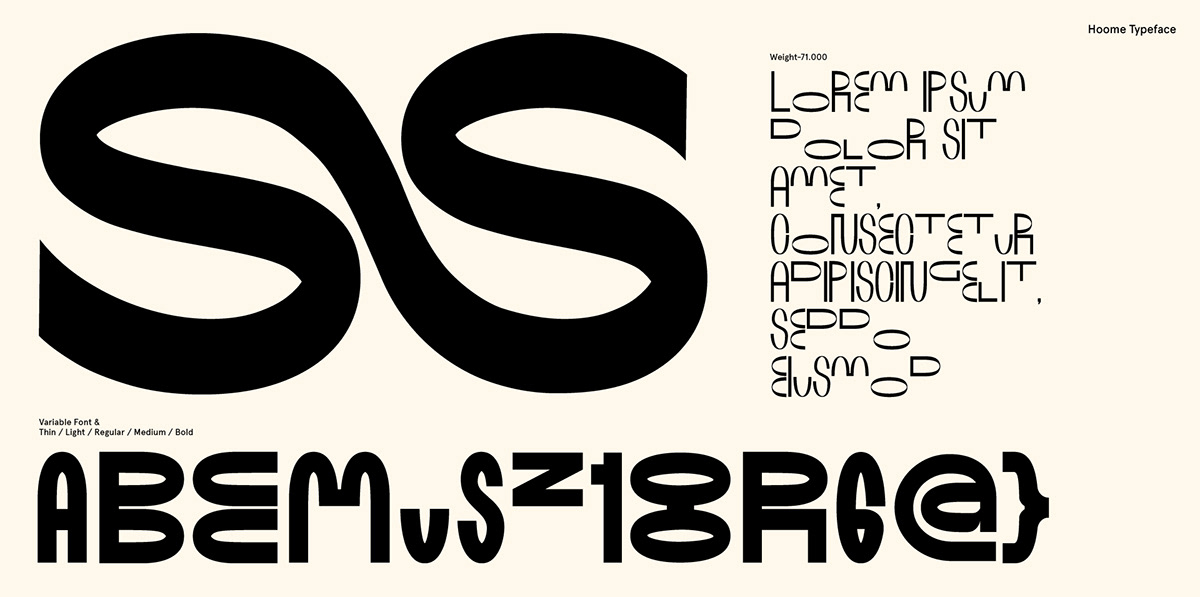


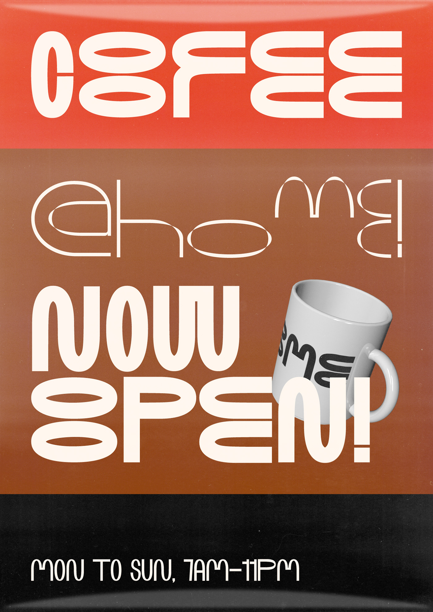
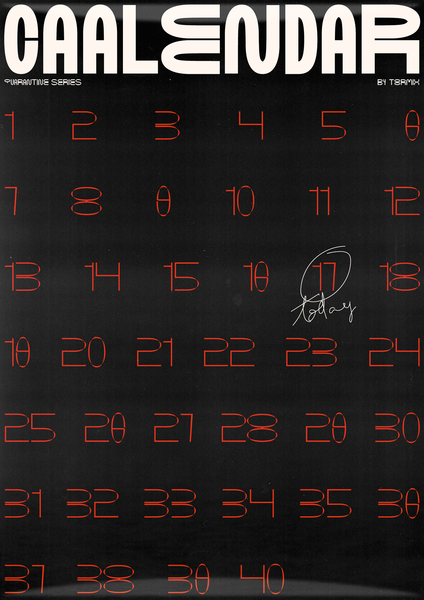

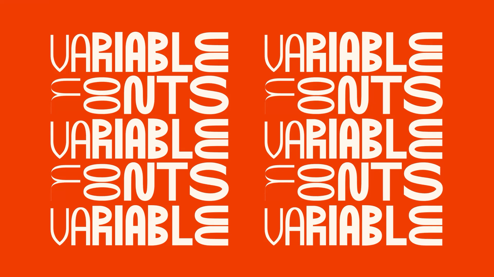


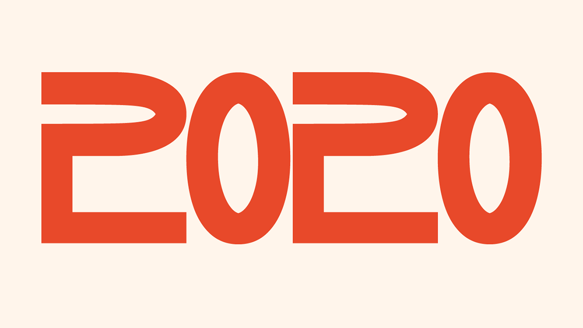
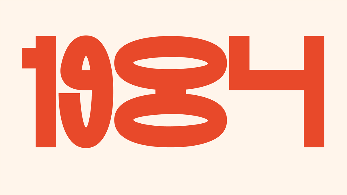
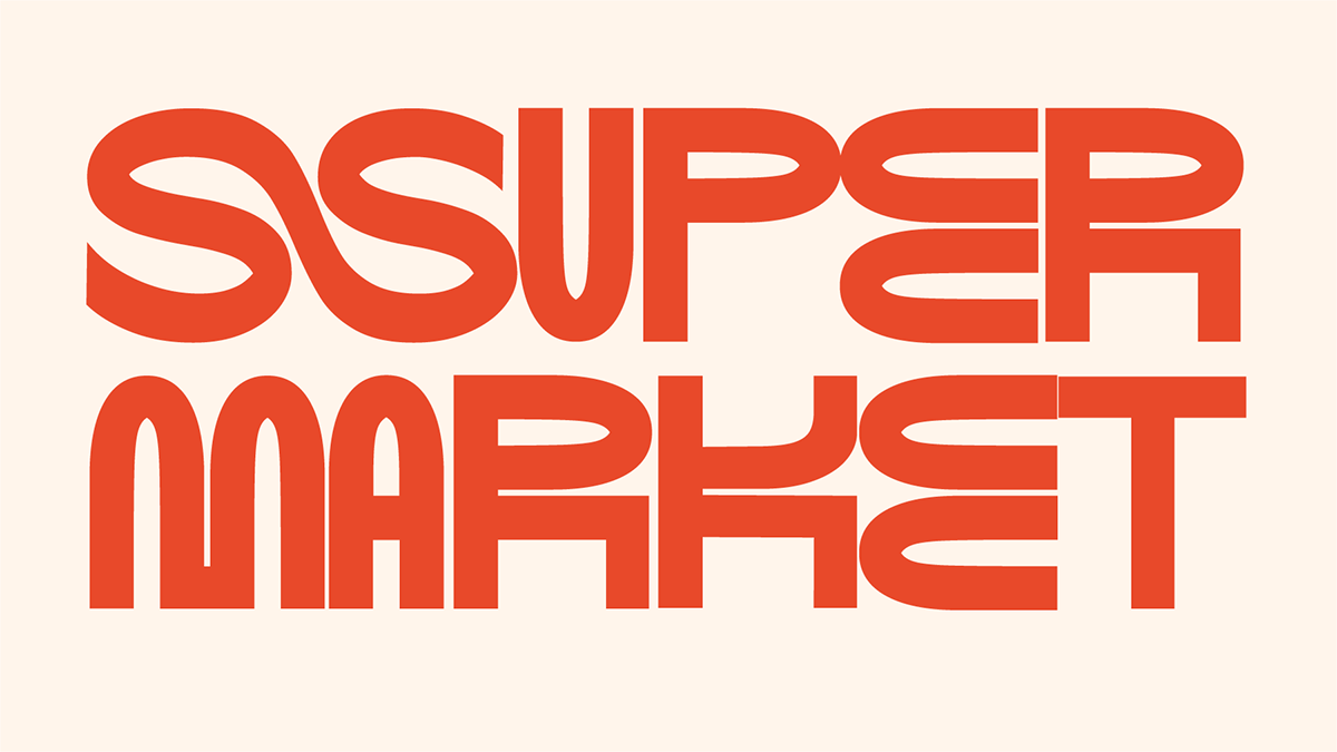
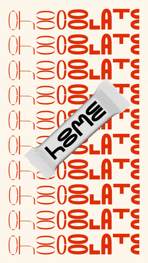
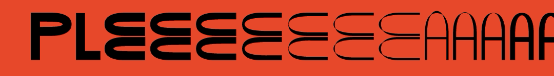
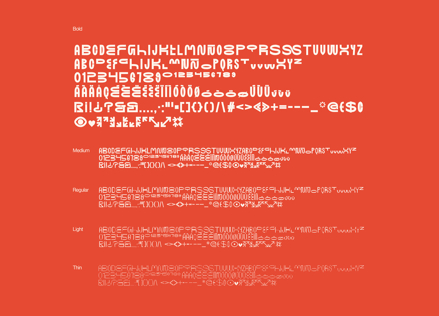
HOOME is an experiment. To be honest, our first experiment with variable typography. And we thought: since it is the first, why not complicating our lives and trespassing the "light" of the family? Why don't we give it one more twist at the end and get it to have torsion?
This led us to a happy accident: at the same time that we modified the weight of the font, we also changed the modulation of each letter, so we have an axis that is actually two... That in theory is wonderful, and in practice... is wonderful too. It's a little unpredictable how each letter will behave with these variables, but that's what we love.